01 · What the method decision decides
Choosing a decoration method is choosing a set of constraints.
Buyers usually arrive with an artwork and ask which method is “best”. The question has no general answer, because each method trades a different set of things: setup cost against unit cost, colour count against gradient, hand feel against durability, fabric freedom against fabric limits.
What the decision actually fixes:
- Setup
- Whether the order carries a fixed cost before the first garment is produced, and how large it is relative to the run.
- Fabric
- Which compositions and structures the method sits on reliably, and which it does not.
- Artwork
- What can be reproduced — flat colour, fine detail, gradients, tone — and what must be simplified.
- Ageing
- How the decoration behaves after repeated washing, and what that does to the perceived quality of the garment.
The right question is therefore not “which method is best” but “which constraints this artwork, this fabric and this quantity can live with”.
02 · Screen printing
Screen printing: flat colour at scale.
Screen printing pushes ink through a mesh, one screen per colour, onto the garment. Each colour in the design needs its own screen, its own setup and its own registration.
- Where it wins. Flat, solid colour and simple graphics at volume. Unit cost falls as quantity rises, because the setup is amortised.
- Where it costs. Setup per colour and per placement. A four-colour print on two positions is a different order from a one-colour chest print.
- Where it struggles. Photographic gradients and very fine detail, which need separation work or special ink systems. Small runs, where setup dominates.
- Fabric fit. Good on cotton and cotton-rich jersey. Stretch and performance fabrics need ink systems matched to the substrate.
Plastisol and water-based inks behave differently in hand feel and opacity, and the choice between them is a specification decision, not a factory preference. Say which you expect, or ask what the artwork implies.
03 · Direct-to-garment
Direct-to-garment printing: detail without screens.
DTG prints ink directly onto the garment with a digital printer, the way a paper printer works. No screens are made, so the setup is mostly file preparation.
- Where it wins. Photographic and multi-colour artwork, small runs, and sampling — the per-unit economics do not punish a low quantity.
- Where it costs. Unit cost stays roughly flat with quantity, so at volume it usually loses to screen printing on price.
- Where it struggles. Very large solid areas, and fabrics that resist water-based ink adhesion. Hand feel and wash-fastness depend heavily on pretreatment.
- Fabric fit. Best on high-cotton jersey. Performance polyester and heavily textured surfaces are less predictable.
DTG and screen printing are not competitors so much as neighbours on a quantity curve. Many ranges use both: DTG for the test and the long tail, screen print once a style proves itself.
04 · Embroidery
Embroidery: structure and perceived value.
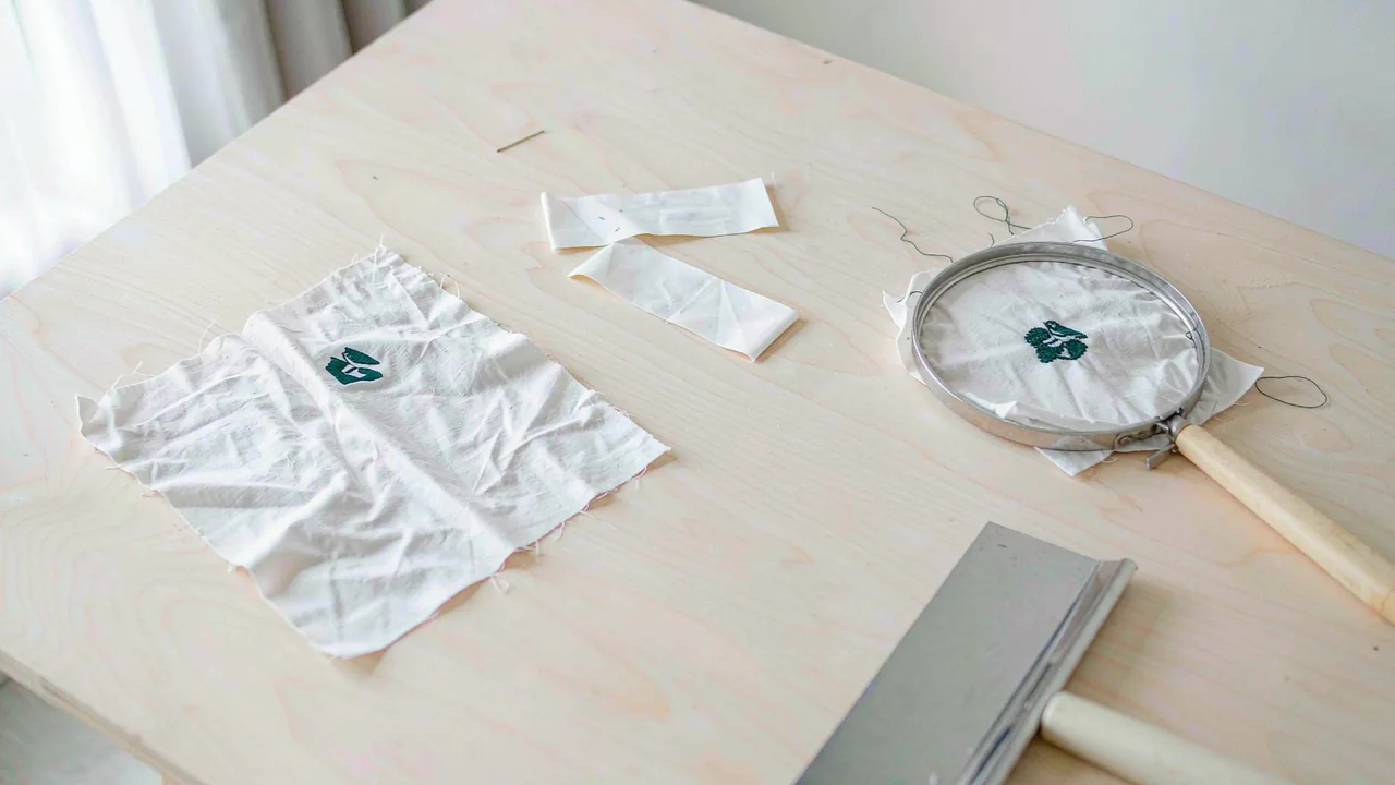
Embroidery stitches the design into the fabric with thread, driven by a digitised file that translates artwork into stitch movement.
- Where it wins. Small logos, left-chest marks, and anything where the decoration should read as part of the garment rather than applied to it. It survives washing well and carries a perceived-value premium.
- Where it costs. Digitising, and then stitch count: cost tracks the area and density of the design, not the colour count.
- Where it struggles. Large fills (heavy, stiff, expensive), fine gradient detail, and fabrics that cannot tolerate needle penetration.
- Fabric fit. Stable knits and wovens. Fine, drapey or loosely knit fabrics pucker and need backing and stabilisation.
Embroidery also changes the garment physically: the backing, the thread tension and the density all add structure. A design that looks light on screen can be heavy in thread.
05 · Other methods
Heat transfer, appliqué and the rest of the set.
The three methods above carry most of the volume, but they are not the whole set, and a few jobs are better served by something else.
- Heat transfer (vinyl and DTF-style). Artwork cut or printed onto a carrier and pressed on. Good for names, numbers and small runs with many variations; a distinct hand feel and a bonded edge that not every market likes.
- Appliqué. Fabric shapes stitched onto the garment. Strong visual weight and texture, common in sweatshirting; carries cutting, placement and wash-shrink considerations.
- Woven and printed labels. Not decoration in the visual sense, but the same approval logic applies: content, placement and the destination-market rules that govern what the label must say.[1]
- Garment dye and wash effects. Applied after making, which changes colour consistency and requires the trims to tolerate the process.
Combinations are normal — an embroidered mark on a screen-printed body, a woven label on a heat-transferred hem. Each added method adds an approval step, and each approval step needs an owner.
06 · Matching method to fabric
Match the method to the fabric before the artwork.
The most expensive decoration mistakes are made in this order: artwork chosen, method chosen, fabric discovered to be wrong for both. Reversing the sequence costs nothing.
- High-stretch jersey
- Needs ink and thread systems that move with the fabric, or the decoration cracks at the first wear.
- Fine, drapey knits
- Embroidery puckers; light screen deposits and transfers usually behave better.
- Brushed and fleece fabrics
- Surface loft interferes with fine detail; prints need a base or a simpler design.
- Performance polyester
- Dye migration and adhesion are real risks; ink systems must be matched and tested.
- Dark fabrics
- Opacity of the deposit becomes the issue, which changes ink system and sometimes the method.
The fabric weight guide covers the weight and composition decision that sits upstream of all of this.
07 · What the artwork file decides
The artwork file decides more than the designer expects.
Decoration is a manufacturing process, and the file is its instruction. What the file contains determines whether the method is even possible, and how much setup it carries.
- Colour count and separation. Drives screen count in screen printing, and therefore setup cost.
- Vector versus raster. Vector art scales cleanly and is needed for clean edges; raster files need resolution to survive enlargement.
- Size and placement. Fixed per position, with tolerance for fabric movement. A placement that ignores the pattern will sit wrong on the body.
- Special colours. If a specific Pantone matters, say so; otherwise the closest available ink is a reasonable substitution.
Say which of these are fixed and which are open. A brief that marks the brand colour as fixed and the background tone as flexible gets a better result than one that is silent on both.
08 · Ageing
Durability and wash behaviour: where quality is actually judged.
A decoration is judged over the life of the garment, not on the day it ships. This is where the method choice is tested, and where the cheap option often becomes the expensive one.
- Cracking. Deposits that cannot follow the fabric's stretch fail at the joints — across the chest print, at the shoulder.
- Fading and bleed. Wash chemistry, temperature and rubbing all move colour; dark grounds are the least forgiving.
- Pilling around the design. A stiff deposit on a soft knit creates a wear zone around it.
- Care information. What the decoration can tolerate must match what the care label tells the customer to do — and the label content is a regulated area, not a design choice.[1]
Ask for the decoration to be wash-tested against the care instructions actually printed, not against a generic assumption.
09 · Approving a strike-off
Approve a strike-off, not a description.
Decoration is approved physically. A description of a method — “screen print, three colours, water-based” — is an instruction, not an approval.
- Approve the placement on a real garment, in the actual size range, not on a flat artwork mock-up alone.
- Approve the colour against a standard, under the same light the buyer will judge it in.
- Approve the hand feel — the deposit stiffness is part of the garment's quality, and it varies more than buyers expect.
- Wash it against the stated care instructions before bulk is committed.
- Seal the approval and reference it in the specification, so bulk has a standard to be inspected against.
The capabilities page lists the decoration options the production network supports and how they are approved. Once the method is settled and the question becomes how the order is built and packed, the packing guide is the next stop; when it becomes a commercial question, continue to sourcing and commercial terms.